ohitashi


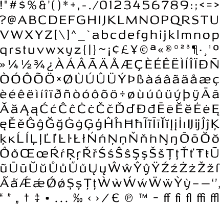
Wide sans serif display fonts are nothing new. The reductive qualities of recent sans serif types aren’t much newer. But how far can a design trend go before running out of steam? Steam power was the last thing Typodermic principal Ray Larabie had in mind when creating Ohitashi. Humanistic stroke contrast combined with organic licks and curls set off by incised detail save this font from the cul de sac endorsed by reductive rivals. Three weights—regular, semi-bold and bold—give Ohitashi practical range.


