soap


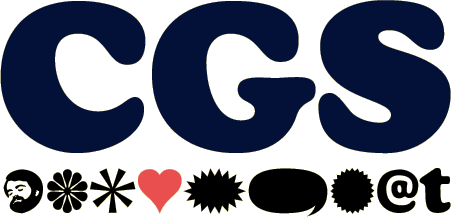
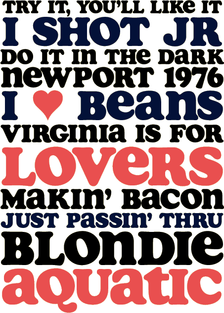
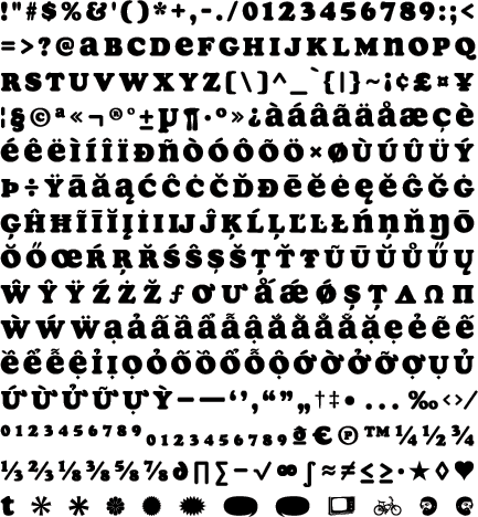
You say Soap looks familiar? Sure, it looks a bit like Cooper Black but Soap is much more. It’s so slick lowercase won’t even stick to it. And check out the top of the C and G. That’s a beautiful thing. Soap’s numerals line up with the capitals making it right-on for t-shirts and titles. Soap has real tight spacing for that pseudo-seventies look.


