meloche


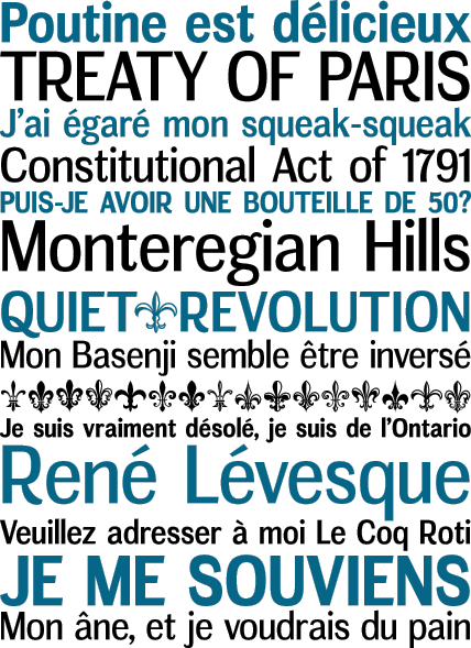
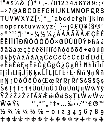
Living in the 21st century has its drawbacks. Just when you thought you were finally living in the future, a client who isn’t quite with it wants packaging design or merchandising to match their old-school material from the 20th century. Geared to fill such anachronistic holes, Meloche mimics the style and feel of grotesk sans serif classics from yesteryear. The typographic ideal passed down from the 18th century was never more generic, with semi-condensed forms, even width capitals, middle-of-the-road line contrast and curled-in stroke ends.


